Tuesday, October 16, 2012
Lab 3
View Amzaing places to go in the Bay Area, CA in a larger map
Neogeography
Maps were created for helping people to locate their positions or to get the routes to their destinations. During recent decades, maps have been changing from some boring pieces of paper to some fancy programs in devices. Neogeography is the most significant example out of these programs.
Since neogeography maps can be created by any person, the credibility of those maps is inevitably low. Meanwhile, these maps are inaccurate as the makers may use simple or even wrong geographic skills instead of professional knowledge to produce maps. These kinds of maps are also subjective since everyone has his or her point of view. For example, let say someone creates a map called "The Top 10 Places That Worth to Visit in L.A.", those places may not be the "top ten" of everyone's minds; it is just the opinion of the map maker.
Nevertheless, this type of mapping provides an opportunity for people to innovate maps. People can show their special talents with their creative maps. Throughout the creating process, people gain a chance to think more. They can also share their knowledge and experiences with the others. Moreover, neogeography has put human beings into a different generation of map. Before, map is a tool for telling the way to reach one destination; however, this latest map is more than getting people from one point to another; instead, it contains many useful information for the users, such as pictures, lengths of the routes, and detailed information of every places.
The benefits of having neogeography is that we have a chance to see more about the earth, where we live in. In addition, neogeography is a users friendly map. On the other hand, we are not able to put everything on the map because there are too many things exist on the earth. Also, we may be misled by certain fake information from neogeography maps.
Friday, October 12, 2012
Lab 2
1. The name of the quadrangle is
Beverly Hills Quadrangle.
2. The adjacent quadrangles:
Canoga Park, Van Nuys, Burbank, Topanga, Hollywood, Pacific Ocean, Venice, and
Inglewood.
3. This quadrangle was first
created in 1966.
4.
Datum
are: North American Datum of 1927 and North American Datum of 1983
5. The scale of this quadrangle
is 1:24,000
6. a) 5 × 24,000 = 120,000 cm
120,000 ÷ 100 = 1,200 m
∴ 5 cm on the map = 1,200 m on the ground
b) 5 × 24,000 = 120,000 in
120,000 ÷ 12 = 10,000 ft
10,000 ÷ 5,280 = 1.8939 miles
∴ 5 in on the map = 1.8939 miles on the ground
c) 1 ÷ 24,000 = 0.000041667 miles
0.000041667 × 5,280 = 0.2200 ft
0.2200 × 12 = 2.64 in
∴ 1 mile on the ground = 2.64 in on the map
d) 1 ÷ 240,000 = 0.000041667 km
0.000041667 × 3 = 0.000125001 km
0.000125001 × 1000 = 0.125001 m
0.125001 × 100 = 12.5001 cm
∴ 3 km on the ground = 12.5 cm on the map
7. The contour
interval is 20
ft
8. a) Latitude:
11.2 cm/14.3 cm = y'/2.5'
minutes = (11.2 ÷ 14.3) × 2.5 = 1.958'
seconds = 0.958' × 60 = 57.48"
minutes and seconds = 2' + 1' + 30" + 57" = 3' 87" = 4' 27"
decimal degrees = 34 + (4 ÷ 60) + (27 ÷ 3600) = 34.07417
Longitude:
5.9 cm/12 cm = y'/2.5'
minutes = (5.9 ÷ 12) × 2.5 = 1.229'
seconds = 0.229' × 60 = 13.74"
minutes and seconds = 25' + 1' + 14" = 26' 14"
decimal degrees = 118 + (26 ÷ 60) + (14 ÷ 3600) = 118.4372
∴ the Public Affairs Building: 34° 4' 27" N, 118° 26' 14" W or +34.0741, - 118.4372
b) Latitude:
2.6 cm/14.3 cm = y'/2.5'
minutes = (2.6 ÷ 14.3) × 2.5 = 0.4545'
seconds = 0.4545' × 60 = 27.27"
minutes and seconds = 0' 27"
decimal degrees = 34 + (27 ÷ 3600) = 34.0075
Longitude:
11 cm/12 cm = y'/2.5'
minutes = (11/12) × 2.5 = 2.29167'
seconds = 0.29167' × 60 = 17.5002"
minutes and seconds = 27' + 2' + 30" + 18" = 29' 48"
decimal degrees = 118 + (29 ÷ 60) + (48 ÷ 3600) = 118.4967
∴ the tip of Santa Monica pier: 34° 0' 27" N, 118° 29' 48" W or +34.0075, -118.4967
c) Latitude:
13.2 cm/14.3 cm = y'/2.5'
minutes = (13.2 ÷ 14.3) × 2.5 = 2.3077'
seconds = 0.3077' × 60 = 18.462"
minutes and seconds = 5' + 2' + 18" = 7' 18"
decimal degrees = 34 + (7 ÷ 60) + (18 ÷ 3600) = 34.1217
Longitude:
10.1 cm/12 cm = y'/2.5'
minutes = (10.1 ÷ 12) × 2.5 = 2.10417'
seconds = 0.10417' × 60 = 6.2502"
minutes and seconds = 22' + 2'+ 30" + 6" = 24' 36"
decimal degrees = 118 + (24 ÷ 60) + (36 ÷ 3600) = 118.41
∴ the Upper Franklin Canyon Reservoir: 34° 7' 18" N, 118° 24' 36" W or +34.1217, -118.41
9. a) Greystone Mansion: 660 ft or 660 × 0.305 = 201.3 m
b) Woodlawn Cemetery: 140 ft or 140 × 0.305 = 42.7 m
c) Crestwood Hills Park: 680 ft or 680 × 0.305 = 207.4 m
b) Woodlawn Cemetery: 140 ft or 140 × 0.305 = 42.7 m
c) Crestwood Hills Park: 680 ft or 680 × 0.305 = 207.4 m
10. UTM zone 11
11. UTM coordinates
are for the lower corner of the map: 362000m E, and 3763000m N.
12. Each square in this map obtains 1,000 square meters.
13.

14. The magnetic declination
is +14°.
15. The water flows from the north to the south because the elevation
in the north is higher than in the elevation in the south.
16.

Tuesday, October 2, 2012
Lab 1
Created by The Texas Tribune
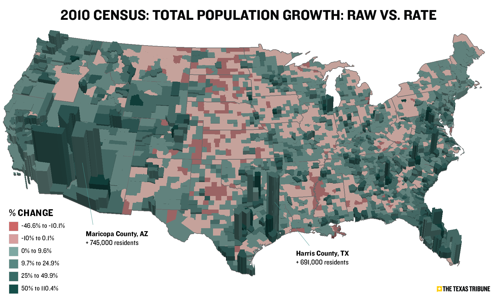
This map describes the total population growth in the United States in 2010. The darker green areas on this map represent a higher population growth; on the other hand, the red areas represent a decreasing population rate. As this map describes, the eastern and western parts of our nation have relatively high population growth rates. What I love about this map is that the three dimension bars on each green region. These bars' height are depend on the population growth rate on that region, which means the tall the bar is, the greater the population rate increase. This design gives the readers a better vision on which state or area has a greater raise on population.

Source: http://blogs.howstuffworks.com/2010/06/29/the-surprisingly-interesting-world-of-strange-maps/
Created by Stephen Von Worley
The majority of people may think that maps are usually showing infrastructures, views of communities, or direction; however, the above map shows different aspect from the other normal maps. This map depicts the location of all McDonalds in the U.S.. Each red spot is representing the location of a McDonalds. I like this map because I can easily tell the concentration of this fast food restaurant in an arbitrary area. Moreover, I like the uniqueness of this map.

Unknown creator.
This is a cartoon map that displays many characteristics of Los Angeles, including landmarks, main streets, main freeways, and, most importantly, famous places for dinning. In this map, we can clearly locate the best restaurants around Los Angeles although the locations may not be accurate. The most interesting thing about this map is that the creator draw a cartoon for each signature restaurant in order to attract the readers; in that way, people can have a easy way to memorize where the restaurant is around.
Subscribe to:
Comments (Atom)